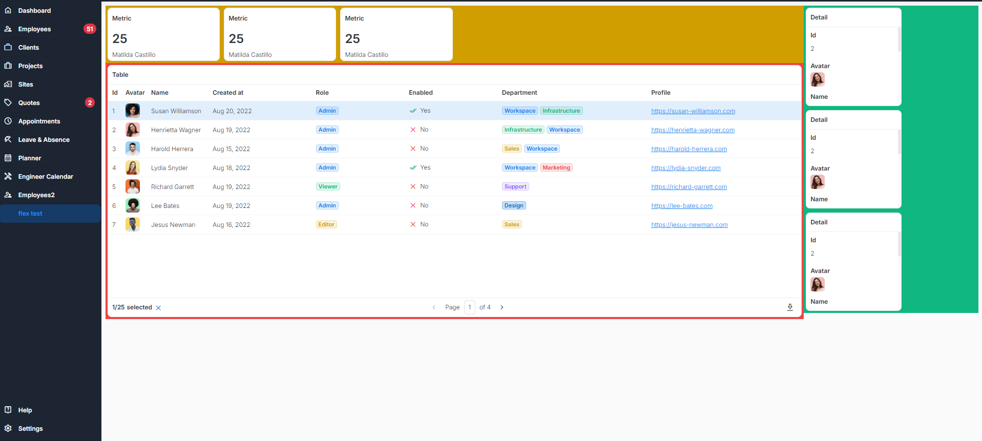
I am trying to set one of my app pages with a header section, a right column and a left column. Header will show title & metrics. Right column will show small detail areas. The left column will show a table. I am having issues getting the table to fill the page.
Here is a rough layout of how i want it to look. The red area is the flex containing only the table. I want that table to fill all remaining space on the screen but i cannot figure it out.
First, I’d get rid of the Flex Container. I advise against using a Flex Container if it’s just for a single component. The point of using flex is to distribute space between items and aligning them.
If you really need a container, use the basic Container instead.
Then, all you would need is to add this to your “Custom Code” section
This will also work if the table is inside a Container, but not if it’s in a Flex Container, that would need some extra stuff.
Also note that this will apply to every table in your app.
If you want to use it just for this specific table, replace ub-smart-table with the name of your table component, e.g. :has(.myTable) (don’t forget the period .)
EDIT
Be aware though, I just noticed that -webkit-fill-available is really greedy in Safari (and probably other Webkit based browsers), you’ll also want to set a max-height. For example, not sure why, but max-height: calc(100% - 150px) somehow works nicely, even when resizing window. At least for me. If this makes you not want to use it, just say the word, there are other solutions.
Hi thanks for the reply.
But that doesn’t seem to work very well at all. max-height: calc(100% - 250px) fits my 27inch PC screen just fine, but the table is too tall for my laptop screen and doesn’t adjust the height when resizing the window like you have said. This is on a blank page with no containers or flex, just the table.
I see. I wanted to use a solution that works dynamically with units like % or vw, but since that doesn’t work well, you can use this:
function setTableHeight() {
  const dropzone = document.querySelector('.dropzone-container'); // main container holding all components
  if (!dropzone) return;
  const maxHeight = dropzone.offsetHeight;

  const tName = `.myTable`; // replace with name of your table
  const selector = `ub-grid-item:has(${tName})`;

  let gridItem = dropzone.querySelector(selector); // either table or first container around table
  if (!gridItem) return;

  const xStart = gridItem.offsetLeft;
  const xEnd = xStart + gridItem.offsetWidth;

  // check if other components are below table, if so add their offset
  const otherComponents = [...dropzone.querySelectorAll(`&>ub-grid-item`)];
  let offset = gridItem.offsetTop;
  for(let c of otherComponents) {
    const left = c.offsetLeft;
    const right = left + c.offsetWidth;
  	if ( (left > xStart && left < xEnd) || (right > xStart && right < xEnd) ) {
    	offset += maxHeight - c.offsetTop;
    }
  }

  const heightCSS = maxHeight - offset + 'px';

  // apply height to all containers and/or table grid-items
  while(gridItem) {
  	gridItem.style.minHeight = heightCSS;
    gridItem = gridItem.querySelector(`ub-grid-item:has(${tName})`);
  }
}
setTableHeight();
window.addEventListener('resize', setTableHeight);
Copy this into a JavaScript Code action and replace myTable with the name of your table component.
Note that this function considers containers around the table and other components below the container/table. Furthermore, it won’t work while editing, but you’ll see that it works in the preview.