Hi @simonzhang,
While I understand that you’d like to have no scrolling and responsive components, what we have here is an inherent “problem” with available and required (visible) space.
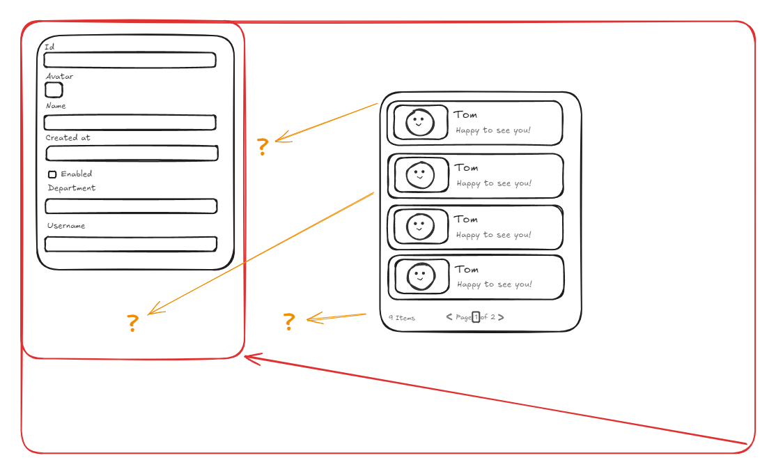
For example, the Form has a certain number of inputs, so it requires enough space to display them all without the need to scroll. On a big screen, we obviously have enough space for that:

But once the screen gets smaller, how do we distribute the space, so everything can still fit? Well, since the inputs and cards in the list view do still have excess space, we can have them adapt by changing the width and/or height, the padding between them, etc. But at one point you’ll reach a limit of how small the inputs, cards, etc. can become so that they still look nice and are not annoyingly small to use, for example with a phone:
At that point, you either need to have scrolling so they can be still a bit bigger, or rearrange the layout. Of course, there are also other strategies, like having something like tabs so you can switch between the Form and the List View or put them inside collapsable cards.
My point being, there is only so much space to distribute to the components, and at some points for smaller screens there need to be compromises in size, layout and so on.
I don’t know if that helps you in any way, but I hope it at least gave you some new thoughts and ideas. If you need concrete help in positioning and sizing the components to your liking, maybe share some screenshots of the problematic screen sizes and how the components behave 