I understand using flexboxes when we have fixed heights.
How can I configure UI bakery so that my UI is fully responsive:
The content will take up the full height of the available screen, and will vertically reposition as the screen height changes?
I’m designing for multiple screen sizes (starting with the LARGE size) and need the layout to retain it’s scale/shrink when there is less vertical screen space.
It appears I need to apply some custom CSS classes (like 100vh) but I’m having trouble understanding where these need to be applied in conjunction with flexboxes.
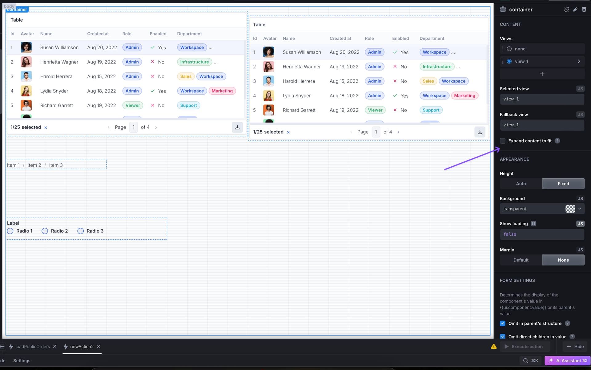
add the rest of the components to the flex component and manage their position from it.
Please note this suggestion might impact the performance of the app.
This:
The content will take up the full height of the available screen, and will vertically reposition as the screen height changes?
is only possible to achieve with 1 component across the whole page with the
‘Expand content to fit’ setting. Or the way you did, combined with the ‘Expand content to fit’ setting.
Here is a modal that I’m trying to re-create.
You can see there is a “fixed” sidebar to the left - full height.
Then, to the right, are 2 - 5 rows (depending on how you slice it or want to handle headers/footers) that also occupies the full height.
How could I replicate this layout in UI Bakery - where if the screen were to resize, the elements would retain their position.
I don’t need EXACT middle and spacing, but I’m trying to avoid having a big empty space at the bottom.
I suspect the details are somewhere in how the containers are managed, but I’m not able to figure it out. When I make the “Expand to Fit All Content” a Flexbox, the nested Flexboxes inside no longer expand to fit. I could definitely be missing something.
Should the correct structure be:
-Modal + Expand to Fit
–Flexbox +ColumnFlex?
—Container1(left side) +Expand to Fit
—Container2(right side) +Expand to Fit
-----(managed positions using the positioning grid)