How to add a tooltip to link component ? I have a side navigation menu with a list of link items and I want to show a tooltip on mouse hover.
Hi @userportfolio,
Natively, UI Bakery doesn’t support a tooltip for the Link component. You will need to use CSS, specifically ::after, ::before and :hover, to show/hide the pseudo-elements.
I quickly threw this together, so it looks very similar to the default tooltip:
<style>
  .customTooltip span {
  	position: relative;
  }

  .customTooltip span::before {
    position: absolute;
    background: #1A1E30;
    color: #f2f2f2;
    padding: 5px 10px;
    width: max-content;
    border-radius: 5px;
    left: 50%;
    top: 0;
    transform: translate(-50%, -33px);
    opacity: 0;
    transition: opacity .3s ease;
    z-index: 9999;
  }

  .customTooltip span::after {
    content: '';
    position: absolute;
  	width: 0;
  	height: 0;
  	border: 6px solid;
  	border-color: #1A1E30 transparent transparent transparent;
    left: 50%;
    top: 0;
    transform: translate(-50%, -8px);
    opacity: 0;
    transition: opacity .1s ease;
    z-index: 9999;
  }

  .customTooltip span:hover::after, .customTooltip span:hover::before {
  	opacity: 1;
  }
</style>
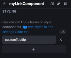
Simply add customTooltip to any Link component you want to have a tooltip:
The text content of the tooltip must be set for each link individually, like so:
.myLinkComponent span::before {
  content: 'blablabla tooltip yeah yeah';
}
This is the best option I can offer, but it can still be expanded upon. You can play around with some properties to make it to your liking.