Hi @AndrewMc and welcome to UI Bakery 
(Hi again, Max after writing this here, sorry this became so long  )
)
I don’t think there is a straightforward example for the Stepper component, at least I couldn’t find anything, so here’s an example:
Stepper vs Steps
Firstly, what component to pick? Well, there is a clear choice to make.
The Steps component is what you would usually, in the context of coding and generally the web, call the Stepper. It only displays the literal steps. You would choose this if you want to make a custom Stepper component.
The Stepper component, on the other hand, already gives you a set structure: a Card component where the steps are displayed in the header, a previous and next button in the footer and the empty card body for you to fill with other components.
So if you only need the component a few times and don’t need too much customization, the Stepper will do perfectly fine. But if you want to define the structure of the Stepper yourself and require more customization, the Steps component is probably the better choice.
It’s also worth mentioning, that if you need a certain component multiple times, it’s recommended to make a module. That way, you don’t have to configure the component every time you need it somewhere.
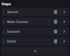
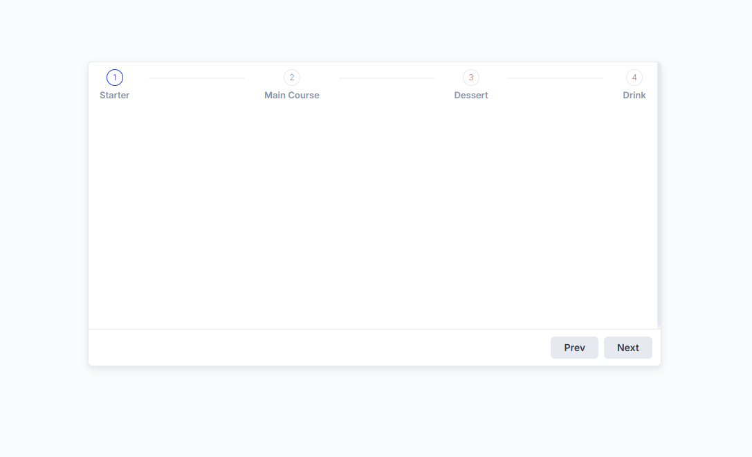
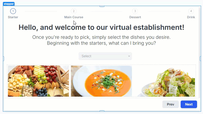
Starting with the steps, for this example, we’ll have a total of 4 steps labelled Starter, Main Course, Dessert, Drink. You could also use the first step as an opener/welcomer, but we won’t do that here.
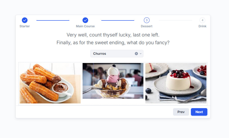
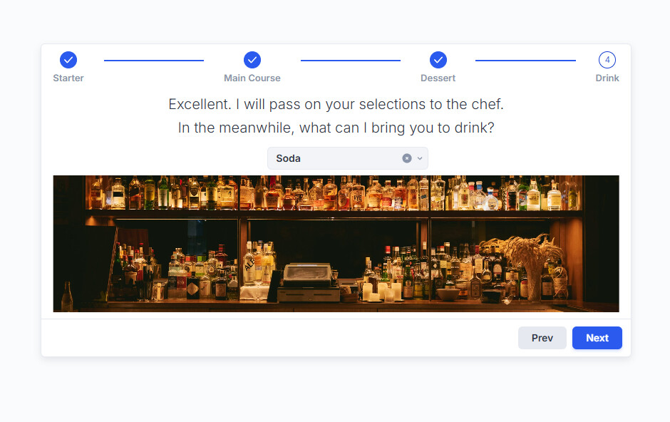
Having all the steps required, let’s set up the content of each step. For each one, we’ll put a text, a Select component and some images inside a Flex Container. The Select’s will each have 3 options according to the current step and Required is checked in their settings.
Great, the component itself is already almost done! Now we need to configure the logic of the component.
Currently, users can change steps by either using the buttons in the footer or clicking on the steps in the header, but only in a linear fashion (can’t jump 2 steps forward, only 1 at the time).
There is an issue, though, specifically with selecting the steps in the header. If you want the user to only proceed to the next step if all the inputs have a valid value, you will need to set that up manually. So you have to make use of the On Next, On Prev and On Step Change triggers. But here comes the problem: On Next and On Prev don’t trigger at all when selecting a step in the header. On the other hand, On Step Change triggers with any change, but only after the change.
Meaning, if the action triggered determines that the user can’t proceed to the selected step and executes {{ ui.stepper.selectStep(...) }} it will jump to the selected step, which causes this blinking effect and also shows the step as already visited:
But {{ui.stepper}} does have a validate() function and valid property which correctly shows false if the selects, that have the required settings checked, don’t have a value. But it still let’s you change steps so I’m not sure what I’m doing wrong here. It would be great if @Kate or someone else from UIB could give some pointers there.
Anyway, with that in mind, the only solution is to manually handle if the user can proceed to the next step. There are multiple ways to do this, but for all of them you need to uncheck Allow step selection in the Stepper’s settings:

Now I will show 2 ways as example on how you could control how the user can proceed steps.
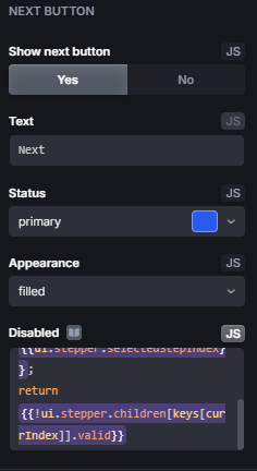
The first one is really simple. We disable the Next button if the inputs on this step aren’t valid. In this example, there is only 1 select per step so it’s fairly easy. All we need is this short snippet:
const keys = {{Object.keys(ui.stepper.children)}};
const currIndex = {{ui.stepper.selectedStepIndex}};
return {{!ui.stepper.children[keys[currIndex]].valid}}
We paste this either into the Disabled option in the Stepper’s settings under Next Button
Or into the Show next button option. But for that, you need to remove the ! in the last line:
And with that the next button is either disabled or not visible at all if the selects don’t have a value.

The second one requires a little more setup, but you can do more with it. For it to work we need to check Control stepper manually

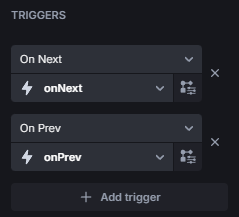
That way, the Prev / Next buttons won’t do anything on their own. Now you can make use of the On Next and On Prev triggers to manually (programmatically) progress the user through the steps, show validation messages, etc.
There are many, many ways to configure those triggers, here would be a basic implementation:
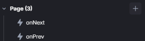
We create 2 actions, I’ll call them onNext and onPrev.
For onNext we have this snippet, which checks if the select in the current step is valid and if there are more steps:
const index = {{data.selectedStepIndex}};
const selects = {{ui.stepper.children}};
const keys = Object.keys(selects);
if(selects[keys[index]].valid && (index + 1) < keys.length) {
  {{ui.stepper.selectStep(index + 1)}};
} else {
  {{selects[keys[index]].validate()}};
}
onPrev just needs to check if we still can go further back:
const index = {{data.selectedStepIndex}};

if (index > 0) {
  {{ui.stepper.selectStep(index - 1)}};
}
If we then set those actions for the appropiate triggers:
and uncheck Linear in the settings

It will look like this:

I think we already saw a lot of the component and I just noticed how long this has become… sorry for that. If there are still things unclear, don’t fret to ask.
Honestly, after writing this I have more questions myself about the component, but I hope you got the general idea