How to change scrollbar color in Table component using custom CSS?
Hi @userportfolio,
What you are looking for is the CSS property scrollbar-color.
So, if you want to change the color of all tables in an app you can do
<style>
  datatable-body {
  	scrollbar-color: red orange;
  }
</style>
If you only want to change it for certain tables, add the name of the component in front of datatable-body like:
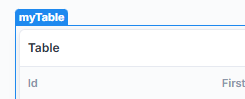
<style>
  .myTable datatable-body {
  	scrollbar-color: red orange;
  }
</style>
Maybe you’re also interested in the CSS property scrollbar-width. As a value, you can set either auto (default) or thin:
scrollbar-width: auto

scrollbar-width: thin
1 Like
Thanks for that.
The scrollbars after applying the CSS looks not so elegant.
Currently the table has this faint vertical scroll that is hard to see. May be there is a way to to just change the trackbar color ?

I also get an unnecessary horizontal scroll after apply CSS

Sadly, there is no way to only change the track or the thumb. When setting colors, both must be set. Just play around with the colors until you like it 
Sorry about the horizontal scrollbar, didn’t even notice that! You can simply add overflow-x: hidden !important; to the style:
<style>
  .myTable datatable-body {
    scrollbar-color: gray red;
    overflow-x: hidden !important;
  }
</style>
Unfortunately I cannot hide the horizontal scrollbar. Some of the tables do have a horizontal scroll to view the columns.
Well, for the ones where you normally wouldn’t have horizontal scrolling, you can at least hide it there:
<style>
  datatable-body {
    scrollbar-color: gray red;
  }

  .myTable datatable-body, .otherTable datatable-body {
    overflow-x: hidden !important;
  }
</style>
How can I achieve the same in the tree component ?
Hi @theuken.
I don’t understand what exactly you are asking. If you can be more specific, I’d be happy to help.
Sorry for the unclear question.
I’m trying to change the color of the scrollbar in the tree component, because it’s near invisible with the default style
No worries 
For the tree component the CSS would still be the same, except using .tree-grid-wrapper instead of datatable-body for the selector.
So something like:
<style>
   .tree-grid-wrapper {
      scrollbar-color: gray red; /* <thumb> <track> */
      scrollbar-width: thin;
   }
</style>
If you want it to apply only to specific tree components when multiple are present or on different pages put .<component-name> at the beginning of the selector (don’t forget the .):
<style>
   .myTreeComponent .tree-grid-wrapper {
      scrollbar-color: gray red; /* <thumb> <track> */
      scrollbar-width: thin;
   }
</style>
Many thx. That’s what I wanted to know.
Where did you find this information ?
No problem!
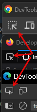
If you mean how I found out which CSS selector to use:
- Open the developer tools (
f12) - Use the thing to select elements on page, which is always in the top left for all major browsers
- Try to click with it directly on the scrollbar, or an element as close as possible. The tree component must be selected (blue border, name on top, etc.) in the editor view for this.
- now it shows you the selected element in the DOM, the one with the scrollbar has that
scrolltag next to it
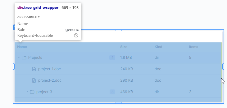
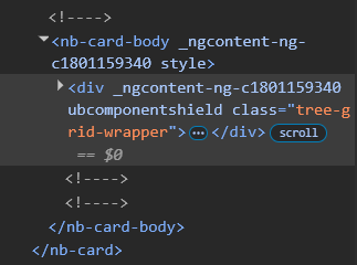
And yeah, there is the class
1 Like