Hi Max,
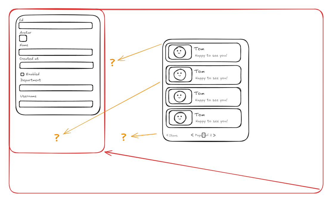
Thank you for your reply but I think you misunderstood the problem. I understand the components are absolute sizing so when they overflow we need to scroll. The problem I have is trying to split the body into two columns (which overflows it’s accepted to scroll), but both columns will need to be 100% vh rather than absolute height. for smaller screens the view height gets smaller, content overflow and user need to scroll for each column, and if the screen size gets bigger, and there are less content of course leaves a blank at the bottom (let’s say I use a flex container in UI Bakery).
Let’s scratch my previous layout assumption out, let’s say I put one flex container within the body, on body I set it to “expand content to fit”. The flex container height is alway 100% and width is always 100%, which is great and how it should behave. However by enabling “expand content to fit”, I can only have one component in it, which is understandable, because the “expand” refers to expand vertically and horizontally or make the container 100% vw and 100% vh. What I’m looking for is a work around to have two flex container in the body, which splits the body into two columns, let’s left column is 30% vw and 100% vh and right column is 70% vw and 100% vh.
In UI bakery’s flex container, we are able to choose flex direction, and through that function I can make sure all components within the flex container to align on top. Therefore, if content is less, all components is on top, and if components/ content overflows user need to scroll.
You might ask why need to have 100% vh, the problem with normal containers is that we can only set it on absolute height. Let’s say as the dev, my screen is large, I set a normal container to the height of my screen (850px) or view port. When content overflow I need to scroll, everything is perfect. However, when a user with smaller screen (650 px) uses the app, they will encounter an issue when there’s content overflow - they will have two scroll bars. One is on the body, because the container set by me is 850px, and the second scroll bar is within the container, cause the data overflows, and this experience kinda sucks for the user.
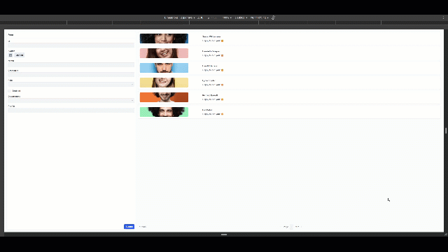
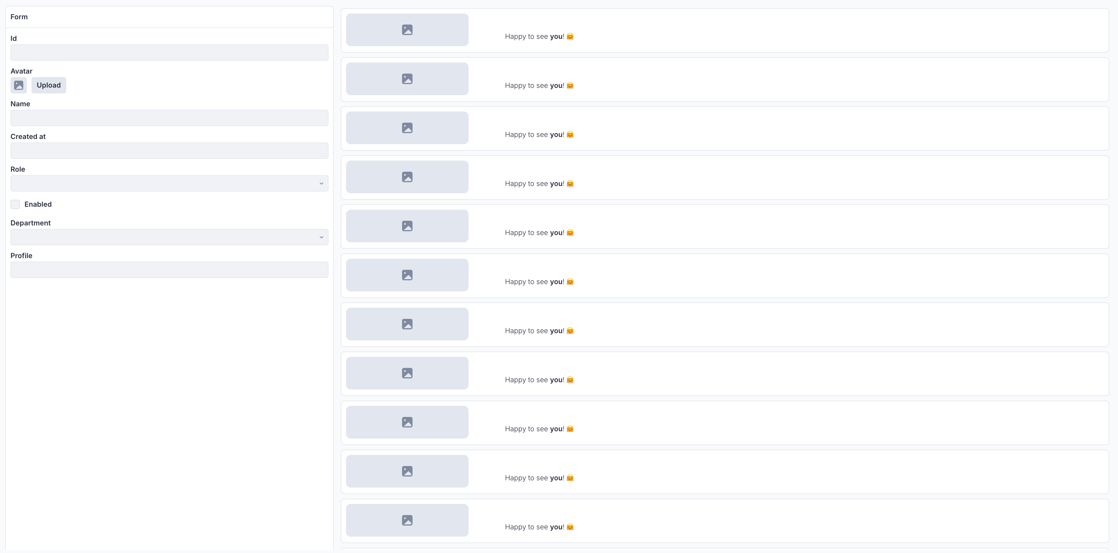
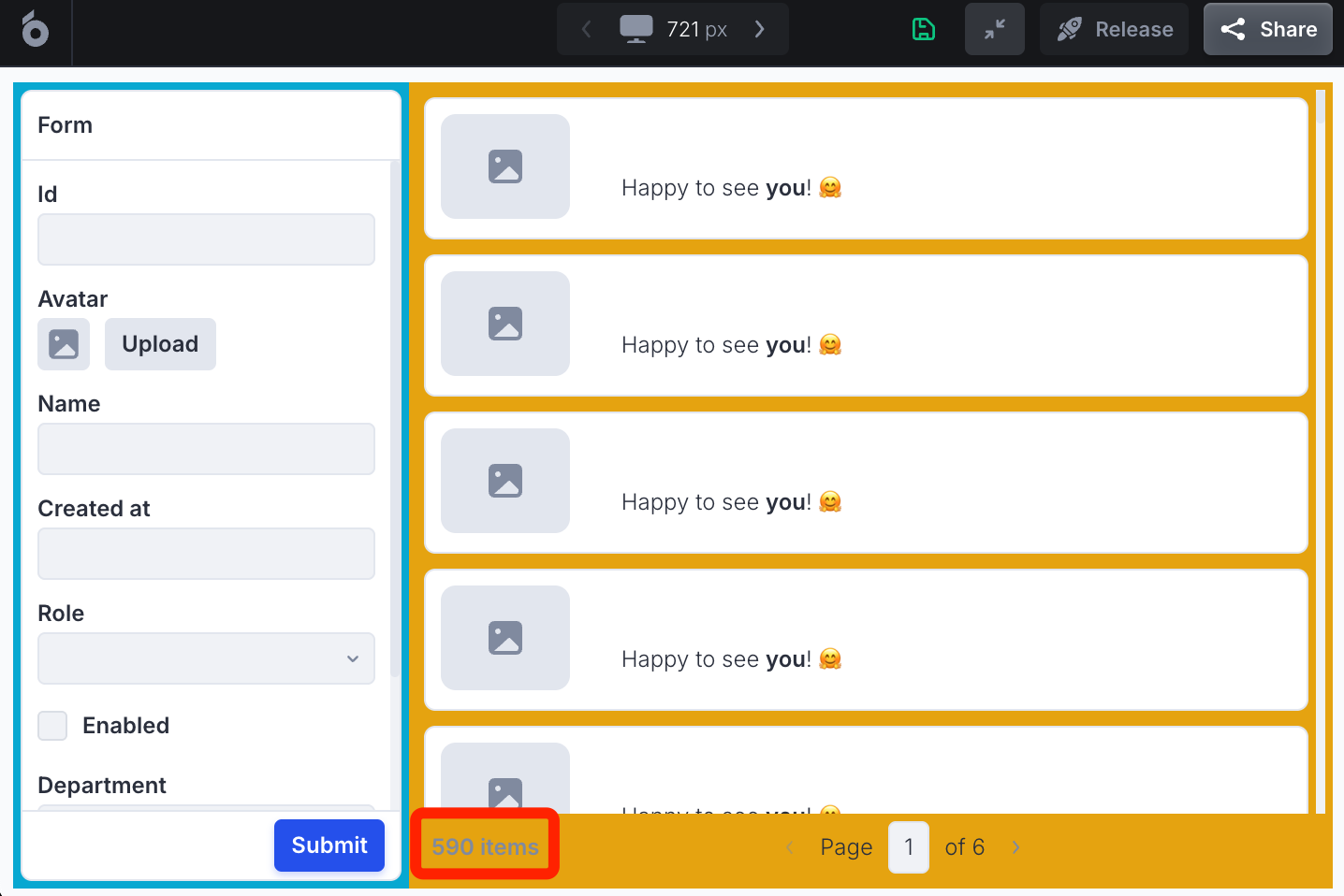
My current workaround is to use the layout sidebar. They layout sidebar and the body forms two columns, in each column I have one card component and expand content to fit. In this case I basically got two containers that adapts the height. Furthermore, a card component have header and footer, which allows me to have some components always at the top of the view port (let’s say the section title) and some always at the bottom, (let’s say some action buttons.) and the middle card body height changes based on screen height. The content in the card body overflows the user can scroll. It works fine, but I just need to sacrifice the sidebar to achieve it.
Not sure if I explained the problem correctly, all good if UI bakery can’t achieve, just looking for alternative work arounds. Thanks for your reply again.
