Check out the updated guide in the replies below!
Hello everyone  ,
,
I wanted to share a way to customize the DatePicker component, so it can be a “MonthPicker” or even a “YearPicker”. (I think) This is not supported natively by UI Bakery, at least yet, so this could be useful in some cases.
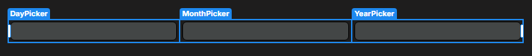
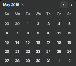
The results look like this:
Q: Why need a Month-/YearPicker and not just an input?
Answer
You might say that it’s not really necessary to customize the DatePicker component and just let the user input something like Feb 2025 into a Text Input component. And depending on your specific needs, that can be the case.
I wanted to customize the DatePicker component because of several reasons. To name some of them:
- The most important for me: a nice UI
- Built-in date validation with error messages
- Built-in timezone conversion
- and some more
Generally, I just think that it makes sense that a DatePicker component should be responsible for date inputs, be it a full date or just month and/or year.
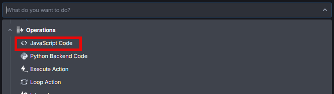
How to customize the component
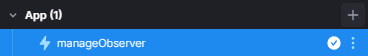
To customize the component, I made use of the Mutation Observer API to observe when the overlay of a DatePicker has been opened.
const handleOverlayChange = () => {
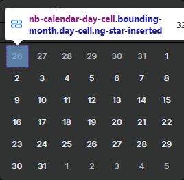
const dayPicker = document.querySelector("nb-calendar-day-picker");
if (!dayPicker) return;
const calendarDayLabels = [...dayPicker.querySelectorAll("nb-calendar-day-cell div")];
const firstOfMonth = calendarDayLabels.find( label => label.textContent.trim() === "1" );
firstOfMonth.parentElement.click();
}
const overlayContainer = document.querySelector(".cdk-overlay-container");
const config = { childList: true, subtree: true };
const observer = new MutationObserver(handleOverlayChange);
observer.observe(overlayContainer, config);
return;
If you have some JavaScript experience, you’ll quickly understand what’s going on here. For people who are not very experienced with coding, you can check out this breakdown of the code:
Breakdown of MonthPicker script
-
The first thing we are doing, is defining the function
handleOverlayChange. We’ll get into what it does below, for now just know that this is the function which theMutationObserverexecutes when something has changed on the page (or more correctly said, on the specifiedtarget) -
Below the function, we are selecting the
cdk-overlay-containerelement on the page. I’m assuming (assuming because I’m not a UI Bakery developer!) that this element manages all the overlays. Since the nice User Interface (UI) that opens when clicking inside aDatePickerinput is an overlay, we need a reference to that component.const overlayContainer = document.querySelector(".cdk-overlay-container"); -
Next, we are defining a variable called
config, which holds an object which defines the configuration we pass to theMutationObserver. It tells the observer what kind of changes we actually want to observe, among other things. For more details, refer to the MDN entry for theobserve()function of theMutationObserver.const config = { childList: true, subtree: true }; -
In the last two lines, we are defining the
observervariable, which receives a newMutationObserverobject. We pass the functionhandleOverlayChangewe defined in the beginning that should be called when something changes. Then with theobserve()function of theObserverwe tell it what target to observe (target here isoverlayContainer) and the configuration (hereconfig).const observer = new MutationObserver(handleOverlayChange); observer.observe(overlayContainer, config); -
Now the
MutationObserverobserves theoverlayContainerelement and because we passedchildListandsubtreein theconfig, it will executehandleOverlayChangeevery time elements are added, removed or changed in the target. -
When the
handleOverlayChangefunction is executed, the first thing it does is trying to find anb-calendar-day-pickerelement. If the element was not found, meaning either a different overlay was opened or this one was closed, we simplyreturnfrom the function.const dayPicker = document.querySelector("nb-calendar-day-picker"); if (!dayPicker) return; -
If an element was found, we go to the next line. There, we are defining a new variable
calendarDayLabels, which receives alldivelements that are direct children of anb-calendar-day-cellelement. Fundamentally, thesenb-calendar-day-cells are all the days visible in the calendar, and thedivinside them wrap the string with the number of each day.const calendarDayLabels = [...dayPicker.querySelectorAll("nb-calendar-day-cell div")];If you don’t know what
[...someVariable]does, take a look at thespread operator -
Finally, in the last two lines of the function, we are searching for the first
divwhich has"1"as textContent. This will get us the first day of the month which the user selected. Then we are finishing off, by programmatically clicking the parent of thediv, thenb-calendar-day-cell, which then sets the date for the input.const firstOfMonth = calendarDayLabels.find( label => label.textContent.trim() === "1" ); firstOfMonth.parentElement.click();
Essentially, what it does, is automatically clicking the first day of the selected month.
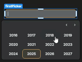
YearPicker
To make this work as a “YearPicker”, we need to build on-top of the current
“MonthPicker” snippet because it still needs to select a day after the month.
The only thing that has to be changed is the handleOverlayChange function. These changes and additions are very few and rather simple. Here is the new function
const handleOverlayChange = () => {
  if (document.querySelector('[id=cdk-overlay-3]')) return;

  const monthPicker = document.querySelector('nb-calendar-month-picker');
  const dayPicker = document.querySelector('nb-calendar-day-picker');

  if (monthPicker) {
    const calendarMonthLabels = [...monthPicker.querySelectorAll('nb-calendar-month-cell div')];
    const firstMonth = calendarMonthLabels.find( label => label.textContent.trim().toLowerCase() === 'jan');
    firstMonth.parentElement.click();
  } else if(dayPicker) {
    const calendarDayLabels = [...dayPicker.querySelectorAll('nb-calendar-day-cell div')];
    const firstOfMonth = calendarDayLabels.find((label) => label.textContent.trim() === '1');
    firstOfMonth.parentElement.click();
  }
};
As you can see, we’re doing the exact same process for the month as for the day. The only other difference is that the ifs, which check if monthPicker and dayPicker are truthy values, are not returning immediately, but rather just skipping their section.
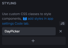
Styling
Brief visibility of day- and monthselector
If you have implemented and tested out one or both of the snippets, you probably have noticed that it still shows the day and month selection for a brief moment before it clicks automatically.
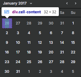
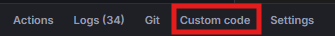
We can very simply hide this by adding some styling under the Custom Code tab at the bottom left
(Technically), All we need to add is this small piece of code
<style>
    .cdk-overlay-pane:has(nb-calendar-day-picker), .cdk-overlay-pane:has(nb-calendar-month-picker) {
      	opacity: 0;
    }
</style>
Of course, if you are just using the MonthPicker, remove the second CSS selector .cdk-overlay-pane:has(nb-calendar-month-picker).
View switch
You might have also noticed that the DatePicker component has this “view switcher” on the top, which switches between year and day selection
It’s actually not really a problem, as it only closes the overlay. But if you want to have it out of the way add this to the style (either
display or opacity, both are not needed)
<style>
    // other things
    nb-calendar-view-mode {
        // either
        display: none !important;
        // or
        opacity: 0;
    }
</style>
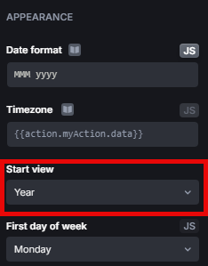
Value display
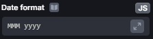
Of course, to have the value display in the text field according to how you want it, simply change the Date Format setting of the component
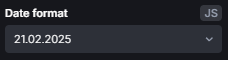
Personally, I like to customize it in the JS format (see image above; JS button, top-right corner). That way you truly can display it the way you wan to
E.g. for a MonthPicker (will display like Feb 2017)
Q: What if I have multiple DatePicker components on a page, do they all have to be either Date-, Month- or YearPicker?
Answer
No, they don’t.
It was a challenge understanding how to differentiate the overlays and identify which overlay is linked with which DatePicker component because on the client-side they don’t have much that identifies them. But I found a way!
Basically, anytime the overlay manager has to display something for the first time, an id will be assigned to its overlay container. The ID looks like cdk-overlay-n where n would be a number starting from 1.
But, it’s not as simple so that you can now just go wild, e.g., thinking cdk-overlay-1 is the first DatePicker component on your page etc. That is because not only DatePicker has overlays, and not always will users open the DatePicker components in the same order. Yes, the cdk-overlay-n ID will be assigned on displaying, so it’s first come, first served.
Conveniently, this allows us to simply open all the DatePicker overlays, in the order we want to when the page has loaded. This way, we can be (at least 99%) sure that the cdk-overlay-n ID corresponds to a DatePicker we want to.
There are for sure other ways to do it, but I did it like this:
const allOverlayContainer = document.querySelector(".cdk-overlay-container");
allOverlayContainer.classList.add("hidden");
document.querySelectorAll("nb-datepicker").forEach( el => {
	const input = el.previousElementSibling;
  if (!input) return;
  input.click()
});
setTimeout( () => {
	document.body.click();
  allOverlayContainer.classList.remove("hidden");
}, 150)
return;
This snippet essentially looks for all nb-datepicker components, clicks on the input of each component so the overlay displays and at the end, after some delay, it clicks on the body, so all overlays close again. Additionally, it adds and removes the hidden class to the main overlay container. The hidden class can also be added to Custom Code and looks like this:
.hidden {
  	display: none !important;
  }
You can also combine this with the CSS, of the nb-calendar-view-mode element, from before:
.hidden, nb-calendar-view-mode {
  	display: none !important;
  }
Now you can selectively use either DatePicker, MonthPicker or YearPicker.
Here are two examples
-
(Blacklist) Excluding a
DatePickercomponent from being aMonthPickerFirst, exclude it from the action that automatically chooses the date
const handleOverlayChange = () => {
    // If overlay with <ID> was found on page, return
    if (document.querySelector("[id=cdk-overlay-<ID>]")) return;
    ...
}
Then, exclude it from the CSS class, so the date selection is visible
/* Here again, replace <ID> with the ID of your choice */ .cdk-overlay-pane:not([id=cdk-overlay-<ID>]):has(nb-calendar-day-picker) { opacity: 0; } -
(Whitelist) Selectively choose a
DatePickerto become aMonthPickerEssentially, you add very similar lines like in the example above, just reversed
const handleOverlayChange = () => {
    // if not this specific overlay with <ID> was found on page, return
    if (!document.querySelector("[id=cdk-overlay-<ID>]")) return;
    // For multiple just add more selectors!
    if (!document.querySelector("[id=cdk-overlay-<ID>], [id=cdk-overlay-<anotherID>]")) return;
    ...
}
And for the CSS class, you replace the
.cdk-overlay-pane:not()with a simple:is():is([id=cdk-overlay-<ID>]):has(nb-calendar-day-picker) { opacity: 0; }
Final notes
-
It’s crucial to set the
Start Viewsetting of theDatePickercomponent to a value according to how you’ve set the customization up.For example, the
MonthPickermust have eitherYearorMonthasStart Viewor else the day selection is displayed, and it clicks on the first day immediately.Technically, with all the information here, you could also set up a
DateComponentto have a fixed year and/or months. Then the user must choose a day from that range (useMin&Maxsettings). Here you want theStart Viewto be Day. -
I have yet to test if there are any issues with multiple pages having different customizedDatePickerand therefore possibly interfering with one another.
 , so I had to do it after work.
 )
)