Hello everyone,
Today I’ll show you how to create a Toggle Button Group as a module so it can be reused in all your apps. This can also be useful as an example what you can do with modules.
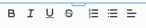
So that we’re on the same page on what a Toggle Button Group is, just think of any rich text editor. The buttons to toggle bold/italic/underlined or similar would be categorized as Toggle Button (Group)
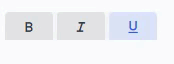
And here is a quick preview of how it will look (colors are customizable):
Step 1 - Place basic structure
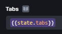
The first thing to do is obviously to create a new module. Starting with a fresh “canvas”, we can now place the first and only component we’ll need for this: the Tabs component.
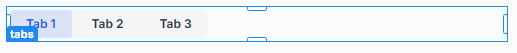
You can make the component the same size as the moduleContainer, since you can still select the container by clicking anywhere outside the component.
Step 2 - Create the main action
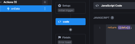
Main Action
Now we create the main action, I’ll name it onData. Select JavaScript Code as step type. This action gets called anytime the module receives new data; therefore, it is like a controller.
And we can enter the first snippet:
const options = {{data || module.data}};
if (!options || options.constructor.name !== 'Object') return;
const commands = Object.keys(options);

for (let c of commands) {
  switch(c) {
    ...
  }
}
Here we have the options passed to the module, be it the initial data of the module or any data passed by ui.myModule.setData(...). If you know a bit of JavaScript, you probably already see that we always want the data passed to be an object. Because from that object we can retrieve the “commands”. Commands, in the sense that we are commanding the module to do something.
Commands
These commands can be whatever you want, but in this example we’ll implement the following ones:
buttons- set the tabs of tabsetsetDisabled- disable all tabs in passed arraysetEnabled- enable all tabs in passed arraysetActive- enable either all tabs passed in array if multiple is true, else just the first one or the passed numbervalueRequired- bool if at least 1 tab must be active or notmultiple- bool if multiple tabs can be active<color|bgColor>- set the color / background color<color|bgColor>:hover- set the color / background color when hovered<color|bgColor>:active- set the color / background color when activealign- aligns the component horizontally; values: <start|center|end>
Step 3 - Initialization
Before we can start implementing the commands, there is something important we can do right at the beginning that makes it possible to have multiple of our Toggle Button Group modules on the same app.
And all we need to do is assign a random class to the container element of the tabs component; while we’re at it, we can also save a reference to the element, since we’ll need that later.
Create 4 new State Variables:
tbg- type set to Object; for saving the reference to the HTML elementtbg_name- type set to String; for saving the class name we assign to the elementmultiple- type set to Boolean; for saving if multiple buttons can be activevalueRequired- type set to Boolean; for saving if at least one button must be active
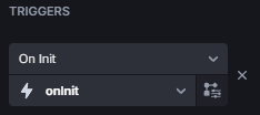
Initializing action
Now, create a new action, I’ll name it onInit and let’s start with this code:
{{state.tbg}} = document.querySelector('ub-tabs-buttons:not([class*=tbg-])');
while ({{!state.tbg.querySelector}}) {
  await new Promise((resolve) => setTimeout(resolve, 10));
  {{state.tbg}} = document.querySelector('ub-tabs-buttons:not([class*=tbg-])');
}
const tbg_name = "tbg-" + Math.random() * (99999 - 10000) + 10000;
{{state.tbg_name}} = tbg_name;
{{state.tbg}}.classList.add(tbg_name);

const initData = {{data || module.data}};
if (initData.multiple) {{state.multiple}} = !!initData.multiple;
if (initData.valueRequired) {{state.valueRequired}} = !!initData.valueRequired;
In the first part we try to get the HTML element of the Tabs component and save it to our tbg state variable. Using a while loop, we make sure to get the element. Then just generate a random name and assign it both to the tbg_name state variable and the element.
In the second part, we check if multiple or valueRequired were passed in the initial data the module starts with.
Init failsafe
Due to the onInit and onData actions running at about the same time when a page with the module is loaded, it could be that a command in onData tries to use {{state.tbg}} before it was saved in the state variable. So we need to add this at the very top of this action to prevent it from running twice:
if (Object.keys({{state.tbg}}).length !== 0) return;
Lastly, set this action for the On Init of the module:
Step 4 - Implementing "buttons"
Element reference failsafe
We can start implementing the “buttons” command in onData now. First, we need to make sure that {{state.tbg}} has a reference to the HTML element and, if not, trigger onInit:
// paste below this line
if (!options || options.constructor.name !== 'Object') return;

if ({{!state.tbg.querySelector}}) {
  await {{actions.onInit.trigger(options)}};
  {{actions.onData.cancel()}};
  {{actions.onData.trigger(options)}};
}
The reason we must also restart onData, is because state variables are read once the action starts and don’t receive any new value while running.
Command “buttons”
Further below, in the switch, we can set our first case.
switch (c) {
  case 'buttons':

    break;
}
The whole “buttons” command is a bit complex, so to keep this short I’ll summarize what the following code snippets do. You can paste them in order one below the other inside the case.
Starting off, we check if the buttons property is an array, that it at least holds 1 item, and every value inside the array is an object with either a title or icon property and a visible boolean property.
if (!options.buttons || options.buttons.constructor.name !== 'Array' || options.buttons.length === 0 || !options.buttons.every((b) => typeof b.title === 'string' || typeof b.icon === 'string'))
  return;
options.buttons.forEach(b => {
  if (typeof b.visible !== 'boolean')
    b.visible = true;
});
Before the next snippet, create 2 state variables: active and tabs, the type of both set to Array. Then set the Tabs setting of the Tabs component to {{state.tabs}}:
Now the complex bit. Every time we change {{state.tabs}}, therefore passing a new configuration to the Tabs component, UI Bakery updates the DOM accordingly. We need to wait for that to be done so we can assign our own classes and event listeners.
const amountBefore = {{ state.tbg.querySelector('.tabset').childElementCount}};
const amountAfter = options.buttons.length;
let childReplaced = false;
let attributesSet = false;

{{ state.active }} = [];
{{ state.tabs }} = options.buttons;

// wait until UIB has updated DOM and classes
await new Promise((resolve) => {
  let nodesChanged = 0;
  let attrChanged = 0;
  let oneActive = false;

  const observer = new MutationObserver((mutations, obs) => {
    for (let m of mutations) {
      if ((m.type === 'childList' && amountBefore && m.removedNodes.length) || (!amountBefore && m.addedNodes.length)) {
        nodesChanged++;
        if ((amountBefore && nodesChanged >= amountBefore) || nodesChanged >= amountAfter) childReplaced = true;
      } else if (childReplaced && m.type === 'attributes' && m.attributeName === 'class') {
        attrChanged++;
        if (({{ state.tbg }}.querySelectorAll('li.tab')[0] === m.target && m.target.classList.contains('active')) || m.target.classList.contains('disabled'))
          oneActive = true;
        if (attrChanged >= amountAfter)
          attributesSet = true;
      }
      if (childReplaced && attributesSet && oneActive) {
        obs.disconnect();
        resolve();
      }
    }
  });
  observer.observe({{ state.tbg }}.querySelector('.tabset'), { childList: true, attributes: true, subtree: true });
});
After waiting, get the updated tabs from the DOM, and replace the event listeners with our own. Don’t worry about {{actions.setInactive}} and {{actions.setActive}}, we’ll create those in the next step.
const btns = {{state.tbg}}.querySelectorAll('li.tab');
btns.forEach((btn, i) => {
  btn.classList.remove('active');
  btn.removeAllListeners();
  btn.addEventListener( 'click', (e) => {
    if (btn.classList.contains('active')) {
      {{actions.setInactive.trigger(i).then(_=>actions.setValue.trigger())}};
    } else if (!btn.classList.contains('active') && !btn.classList.contains('disabled')) {
      {{actions.setActive.trigger(i).then(_=>actions.setValue.trigger())}};
    }
  }, true);
});
And lastly, we check if initActive was passed in the data and set those active. If not, check if valueRequired is true and if so, make the first tab active.
if ((options.initActive && options.initActive.constructor.name === 'Array' && options.initActive.length) || (typeof options.initActive === 'number' && !isNaN(options.initActive))) {
  if (typeof options.initActive === 'number') options.initActive = [options.initActive];
  options.initActive = options.initActive.filter((a) => a > -1 && a < {{ state.tabs.length }});
  if (options.initActive.length > 0)
    await {{actions.setActive.trigger(state.multiple ? options.initActive : options.initActive[0])}};
} else if ({{ state.valueRequired }}) {
  await {{actions.setActive.trigger(0)}};
}
Step 5 - Implementing "setActive" & "setInactive"
Actions “setActive” & “setInactive”
As you can already imagine, we start by creating 2 new actions: setActive and setInactive. Again, I’ll show and explain you the parts one by one and you can just following along; we start with setActive.
First we get the data passed to the action, the tabs set, and all unique properties of all tab objects combined. Then some type checks are done and we make sure that from here on we are working with an array:
const tabsData = {{ data }};
const tabs = {{state.tabs}};
const keys = {{ [...new Set(tabs.reduce((acc, curr)=>{acc.push(...Object.keys(curr)); return acc}, []))] }};

if (tabsData?.constructor?.name !== 'Array' && tabsData?.constructor?.name !== 'Object' && tabsData?.constructor?.name !== 'Number') return "Invalid variable type '" + tabsData?.constructor?.name + "'";

const unfiltered = [];
if (typeof tabsData === 'number' || tabsData.constructor.name === 'Object') unfiltered.push(tabsData);
else unfiltered.push(...tabsData);
Quickly check if there are already tabs active and if multiple is false, if true, simply make all tabs inactive and remove all but the first entry of the “tabs to be made active” array.
if ({{ state.active.length }} && {{ !state.multiple }}) {
	await {{actions.setInactive.trigger(state.active)}};
  unfiltered.splice(1);
};
And for the last part of this action, filter any entry that is a number above or below what can be selected or that is an object that contains properties that are not present on any tab.
Then iterate each tab and determine whether it should be made active or not, and set it active if so.
const filtered = unfiltered.filter((t, i) =>
  (typeof t === 'number' && !isNaN(t) && t > -1 && t < {{state.tabs.length}}) ||
  (t.constructor.name === 'Object' && Object.keys(t).every(k => keys.includes(k)))
);

const btns = {{state.tbg}}.querySelectorAll('li.tab');

btns.forEach( (btn, i) => {
  const setActive = filtered.some(f => {
    if (typeof f === 'number' && i === f)
      return true;
    else if (f.constructor.name === 'Object' && Object.keys(f).every(k => f[k] === tabs[i][k])) {
      return true;
    }
    return false;
  });
  if (!setActive) return;
  btn.classList.add('active');
  {{state.active.push(i)}}
});
setInactive does almost the exact same things. The only differences are that we check at the beginning if it’s even possible to set something inactive and that we remove the active class and remove the index from {{state.active}} instead of of adding:
if (({{state.active.length}} === 1 && {{state.valueRequired}} && {{!actions.setActive.loading}})) return "At least one tab must be active";
if ({{!state.active.length}}) return "Nothing active";

const tabsData = {{ data }};
const tabs = {{state.tabs}};
const keys = {{ [...new Set(tabs.reduce((acc, curr)=>{acc.push(...Object.keys(curr)); return acc}, []))] }};

if (tabsData?.constructor?.name !== 'Array' && tabsData?.constructor?.name !== 'Object' && tabsData?.constructor?.name !== 'Number') return "Invalid variable type '" + tabsData?.constructor?.name + "'";

const unfiltered = [];

if (typeof tabsData === 'number' || tabsData.constructor.name === 'Object') unfiltered.push(tabsData);
else unfiltered.push(...tabsData);

const filtered = unfiltered.filter((t, i) =>
		(typeof t === 'number' && !isNaN(t) && t > -1 && t < {{state.tabs.length}}) ||
    (t.constructor.name === 'Object' && Object.keys(t).every(k => keys.includes(k)))
);

const btns = {{state.tbg}}.querySelectorAll('li.tab');

btns.forEach( (btn, i) => {
  if ({{!state.active.includes(i)}}) return;
	const setInactive = filtered.some(f => {
  	if (typeof f === 'number' && i === f)
    	return true;
    else if (f.constructor.name === 'Object' && Object.keys(f).every(k => f[k] === tabs[i][k])) {
    	return true;
    }
    return false;
  });
  if (!setInactive) return;
  btn.classList.remove('active');
  let found = {{state.active.findIndex(a => a === i)}};
  if (found > -1)
  	{{state.active.splice(found, 1)}};
  else
    throw new Error("Couldn't find index " + i);
});
Command “setActive” & “setInactive”
Finally, add the case for both commands in onData:
case 'setActive':
  await {{actions.setActive.trigger(options.setActive)}};
  break;
case 'setInactive':
  await {{actions.setInactive.trigger(options.setInactive)}};
  break;
Step 6 - Implementing "setEnabled" & "setDisabled"
Actions “setEnabled” & “setDisabled”
Again, create 2 new actions: setEnabled and setDisabled. Starting with setEnabled, this is the whole code we need:
let toEnable = {{data}};
const tabs = {{state.tabs}};
const keys = {{ [...new Set(tabs.reduce((acc, curr)=>{acc.push(...Object.keys(curr)); return acc}, []))] }};

if (typeof toEnable === 'number' || toEnable.constructor.name === 'Object') toEnable = [toEnable];
if (toEnable?.constructor?.name !== 'Array' || toEnable.some(b => (b < 0 || b >= {{state.tabs.length}}) || !Object.keys(b).every(k => keys.includes(k))) ) return 'Data invalid: ' + toEnable;

const btns = {{state.tbg}}.querySelectorAll('li.tab');
btns.forEach( (btn, i) => {
	const setEnabled = toEnable.some(f => {
  	if (typeof f === 'number' && i === f)
    	return true;
    else if (f.constructor.name === 'Object' && Object.keys(f).every(k => f[k] === tabs[i][k])) {
    	return true;
    }
    return false;
  });
  if (!setEnabled) return;
  btn.classList.remove('disabled');
});
The idea here is very similar to setActive, but with fewer things to check before enabling. Normally, you would set tabs disabled by adding disabled: true to the options of the tab, but that would be a lot more complicated since it would change the DOM and classes. We would have to do the waiting like for the “buttons” command. That’s why we simply add the class ourselves.
setDisabled is exactly the same, but flipped:
let toDisable = {{data}};
const tabs = {{state.tabs}};
const keys = {{ [...new Set(tabs.reduce((acc, curr)=>{acc.push(...Object.keys(curr)); return acc}, []))] }};

if (typeof toDisable === 'number' || toDisable.constructor.name === 'Object') toDisable = [toDisable];
if (toDisable?.constructor?.name !== 'Array' || toDisable.some(b => (b < 0 || b >= {{state.tabs.length}}) || !Object.keys(b).every(k => keys.includes(k))) ) return 'Data invalid: ' + toDisable;
const btns = {{state.tbg}}.querySelectorAll('li.tab');
btns.forEach( (btn, i) => {
	const setDisabled = toDisable.some(f => {
  	if (typeof f === 'number' && i === f)
    	return true;
    else if (f.constructor.name === 'Object' && Object.keys(f).every(k => f[k] === tabs[i][k])) {
    	return true;
    }
    return false;
  });
  if (!setDisabled) return;
  btn.classList.add('disabled');
});
Commands “setEnabled”, “setDisabled”, “valueRequired” and “multiple”
The last thing to do is to add the case for the commands in onData. While we’re at it, we can also add the ones for multiple and valueRequired:
case 'setDisabled':
  await {{actions.setDisabled.trigger(options.setDisabled)}};
  break;
case 'setEnabled':
  await {{actions.setEnabled.trigger(options.setEnabled)}};
  break;
case 'valueRequired':
  {{state.valueRequired}} = !!options.valueRequired;
  break;
case 'multiple':
  {{state.multiple}} = !!options.multiple;
  break;
Step 7 - Priorities
Implementing priorities
Here’s a short step. Point being, now that we have multiple commands, if we don’t control what comes first, some issues can happen. That’s why we need to implement priorities. In onData, replace the line
const commands = Object.keys(options);
with
const priorities = {
  'buttons': 2,
  'setActive': 4,
  'setInactive': 4,
  'setEnabled': 3,
  'setDisabled': 3,
  'valueRequired': 1,
  'multiple': 1,
};

const commands = Object.keys(options).filter((k) => !['initActive'].includes(k));

commands.sort((a, b) => {
  if (priorities[a] > priorities[b]) return 1;
  else if (priorities[a] < priorities[b]) return -1;
  return 0;
});
Now the commands array is sorted, and things happen in the order we want them to.
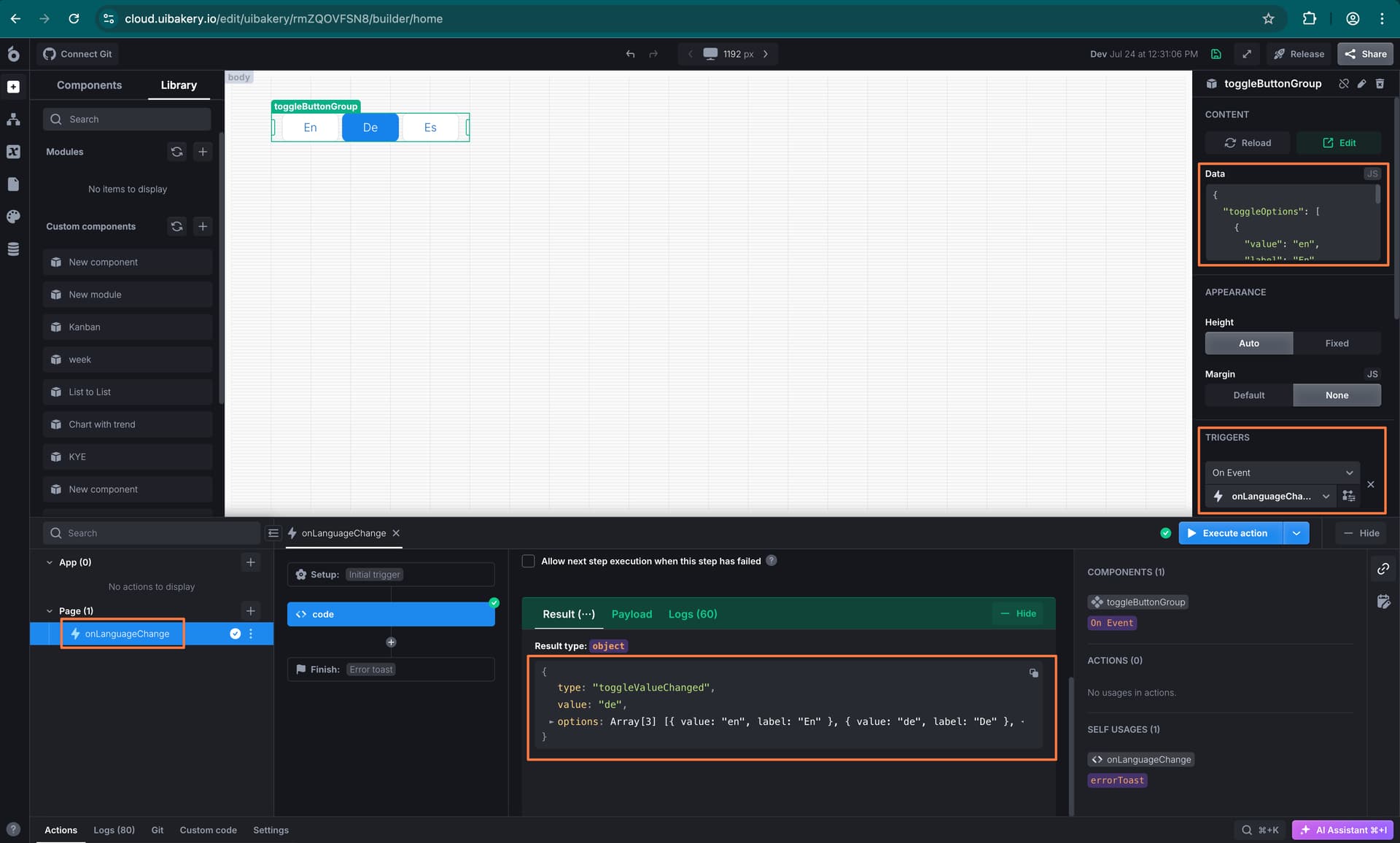
Testing what we have up to now
Configuration before testing
At this point you can already test what we have implemented. To do that, add onData for the modules On Data trigger and set this as the Default Module Data:
{
  buttons: [
    { icon: 'format_bold_material' },
    { icon: 'format_italic_material' },
    { icon: 'format_underlined_material' },
  ],
  multiple: true,
  initActive: 1
}
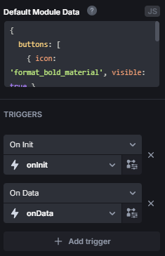
If you reload the page, onInit should have executed, but not onData! This only happens in the module editor, if used on an app, it will also run onData automatically, but here we have to execute it ourselves. After doing that, you should see the tabs like this:
Usage examples
You can also test setActive and the other commands from a temporary action. For example:
{{ actions.onData.trigger( {setActive: 0} ) }}
or
{{ actions.onData.trigger( {setDisabled: 2} ) }}
or, one thing I really like about this implementation is we can also execute those commands based on properties:
{{ actions.onData.trigger({setEnabled: {icon: 'format_underlined_material'}, setInactive: {visible: true} }) }}
Every tab that has icon: format_underlined_material will be enabled, and every tab that has visible: true will be inactive.
Step 8 - Styling
Let’s get to the styling of the tabs.
Icon alignment fix
Something you might have already noticed, is that if the tab only has an icon and no title, the icon will not be centered correctly. We can fix that easily using the :empty CSS pseudoclass. Under Custom Code paste this code:
<style>
  ub-tabs-buttons .tab-text:empty {
    display: none;
  }
</style>
The icons should be centered now.
Colors
Next, we want to customize the colors of the tabs. For that, we first need CSS variables to work with. Paste this inside the style we just created:
ub-tabs-buttons {
  --tbg-text-color: var(--tabset-tab-text-color);
  --tbg-bg-color: var(--tabset-tab-background-color);
}

ub-tabs-buttons a {
  color: var(--tbg-text-color) !important;
  background-color: var(--tbg-bg-color) !important;
}
This also makes sure we use the default colors if we don’t set anything. Then in onData add new cases:
case 'color':
  if (!options.color || typeof options.color !== 'string' || !CSS.supports('color', options.color)) return;
  {{state.tbg}}.style = ({{state.tbg}}.getAttribute('style') || '') + ' --tbg-text-color: ' + options.color;
  break;
case 'bgColor':
  if (!options.bgColor || typeof options.bgColor !== 'string' || !CSS.supports('color', options.bgColor)) return;
  {{state.tbg}}.style = ({{state.tbg}}.getAttribute('style') || '') + ' --tbg-bg-color: ' + options.bgColor;
  break;
If you add bgColor: "red", color: "blue" in the Default Module data or pass it to onData like
{{ actions.onData.trigger({ color: "blue", bgColor: "red" }) }}
It should display with a red background and blue font.
Of course we can also customize the colors when active, disabled or hovered. Add this to the style in Custom Code:
ub-tabs-buttons {
  ...
  --tbg-text-color-hover: var(--tabset-tab-hover-text-color);
  --tbg-bg-color-hover: var(--tabset-tab-hover-background-color);
  --tbg-text-color-active: var(--tabset-tab-active-text-color);
  --tbg-bg-color-active: var(--tabset-tab-active-background-color);
  --tbg-text-color-disabled: var(--tabset-tab-text-color);
  --tbg-bg-color-disabled: var(--tabset-tab-background-color);
}

ub-tabs-buttons li:hover a {
  color: var(--tbg-text-color-hover) !important;
  background-color: var(--tbg-bg-color-hover) !important;
}

ub-tabs-buttons li.active a {
  color: var(--tbg-text-color-active) !important;
  background-color: var(--tbg-bg-color-active) !important;
}

ub-tabs-buttons li.disabled a {
  color: var(--tbg-text-color-disabled) !important;
  background-color: var(--tbg-bg-color-disabled) !important;
}
and these cases to onData:
case 'bgColor:hover':
  if (!options['bgColor:hover'] || typeof options['bgColor:hover'] !== 'string' || !CSS.supports('color', options['bgColor:hover'])) return;
  {{state.tbg}}.style = ({{state.tbg}}.getAttribute('style') || '') + ' --tbg-bg-color-hover: ' + options['bgColor:hover'];
  break;
case 'bgColor:active':
  if (!options['bgColor:active'] || typeof options['bgColor:active'] !== 'string' || !CSS.supports('color', options['bgColor:active'])) return;
  {{state.tbg}}.style = ({{state.tbg}}.getAttribute('style') || '') + ' --tbg-bg-color-active: ' + options['bgColor:active'];
  break;
case 'bgColor:disabled':
  if (!options['bgColor:disabled'] || typeof options['bgColor:disabled'] !== 'string' || !CSS.supports('color', options['bgColor:disabled'])) return;
  {{state.tbg}}.style = ({{state.tbg}}.getAttribute('style') || '') + ' --tbg-bg-color-disabled: ' + options['bgColor:disabled'];
  break;
case 'color:hover':
  if (!options['color:hover'] || typeof options['color:hover'] !== 'string' || !CSS.supports('color', options['color:hover'])) return;
  {{state.tbg}}.style = ({{state.tbg}}.getAttribute('style') || '') + ' --tbg-text-color-hover: ' + options['color:hover'];
  break;
case 'color:active':
  if (!options['color:active'] || typeof options['color:active'] !== 'string' || !CSS.supports('color', options['color:active'])) return;
  {{state.tbg}}.style = ({{state.tbg}}.getAttribute('style') || '') + ' --tbg-text-color-active: ' + options['color:active'];
  break;
case 'color:disabled':
  if (!options['color:disabled'] || typeof options['color:disabled'] !== 'string' || !CSS.supports('color', options['color:disabled'])) return;
  {{state.tbg}}.style = ({{state.tbg}}.getAttribute('style') || '') + ' --tbg-text-color-disabled: ' + options['color:disabled'];
  break;
Tabs alignment
One last thing we can add is align. Again, copy this into your style:
ub-tabs-buttons {
  ...
  --tbg-justify-content: start;
}

ub-tabs-buttons ul.tabset {
  justify-content: var(--tbg-justify-content);
}
And this case to onData:
case 'align':
  if (!['start', 'center', 'end'].includes(options['align'])) return;
  {{state.tbg}}.style = ({{state.tbg}}.getAttribute('style') || '') + ' --tbg-justify-content: ' + options['align'];
  break;
Step 9 - Exposing a value
How to read values
We’ve reached the last step. Communicating from the app with the module should work with all commands now. But we don’t have any way yet to read the value. So let’s create one final action: setValue. You can do here completely as you wish; the only important thing is that you use {{module.triggerEvent(...)}}. Whatever you pass to this function is available from the outside as {{ui.<component_name>.value}}:
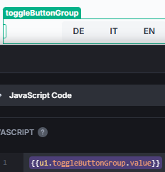
Plus, you can react upon value change with the On Event trigger modules have.
My implementation
I like to keep my options open for the future; that’s why I expose in setValue a lot of stuff, simply to keep the current values available:
const ret = {};
ret.active = {{state.multiple}} ? {{state.active}} : {{state.active.at(0) ?? null}};
ret.value = {{state.multiple}} ? {{state.tabs.filter( (t,i)=>state.active.includes(i) ).map(t=>t.value ?? null)}} : {{state.tabs[state.active[0]]?.value ?? null}};
ret.tabs = {{state.tabs}};
ret.settings = {};
ret.settings.valueRequired = {{state.valueRequired}};
ret.settings.multiple = {{state.multiple}};
{{module.triggerEvent(ret)}};
Everything here should be pretty clear, maybe except for ret.value. To put it simply, in the objects that define the tabs, you can put anything you want besides the required title or icon and visible, they could look like:
[
  { title: 'German', value: 'de', code: 25216 },
  { title: 'English', value: 'en', code: 8362, locale: 'US' },
  { title: 'Spanish', value: 'sp', code: 26643, randomProperty: true }
]
And ret.value exposes the value property (if present) of all active tabs. This flexibility of properties also makes it easier to enable/disable/activate/… tabs as you could categorize them by properties.
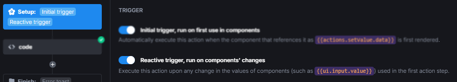
setValue settings
Activate Reactive Trigger for setValue:
And set setValue as Chain Action for onData on success:
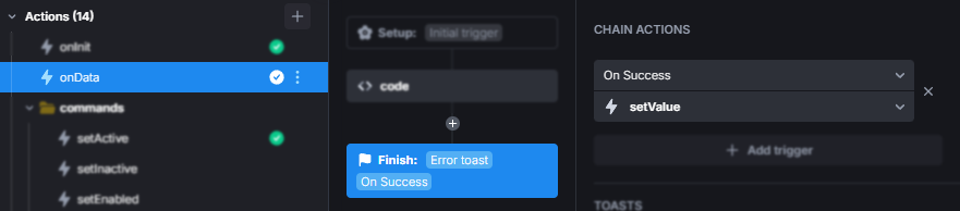