Change the sidebar-header disposition and make the sidebar heigh 100% even if there is a header

I would like to change the header-sidebar disposition (as shown in the photo)

The idea is to build something like this:

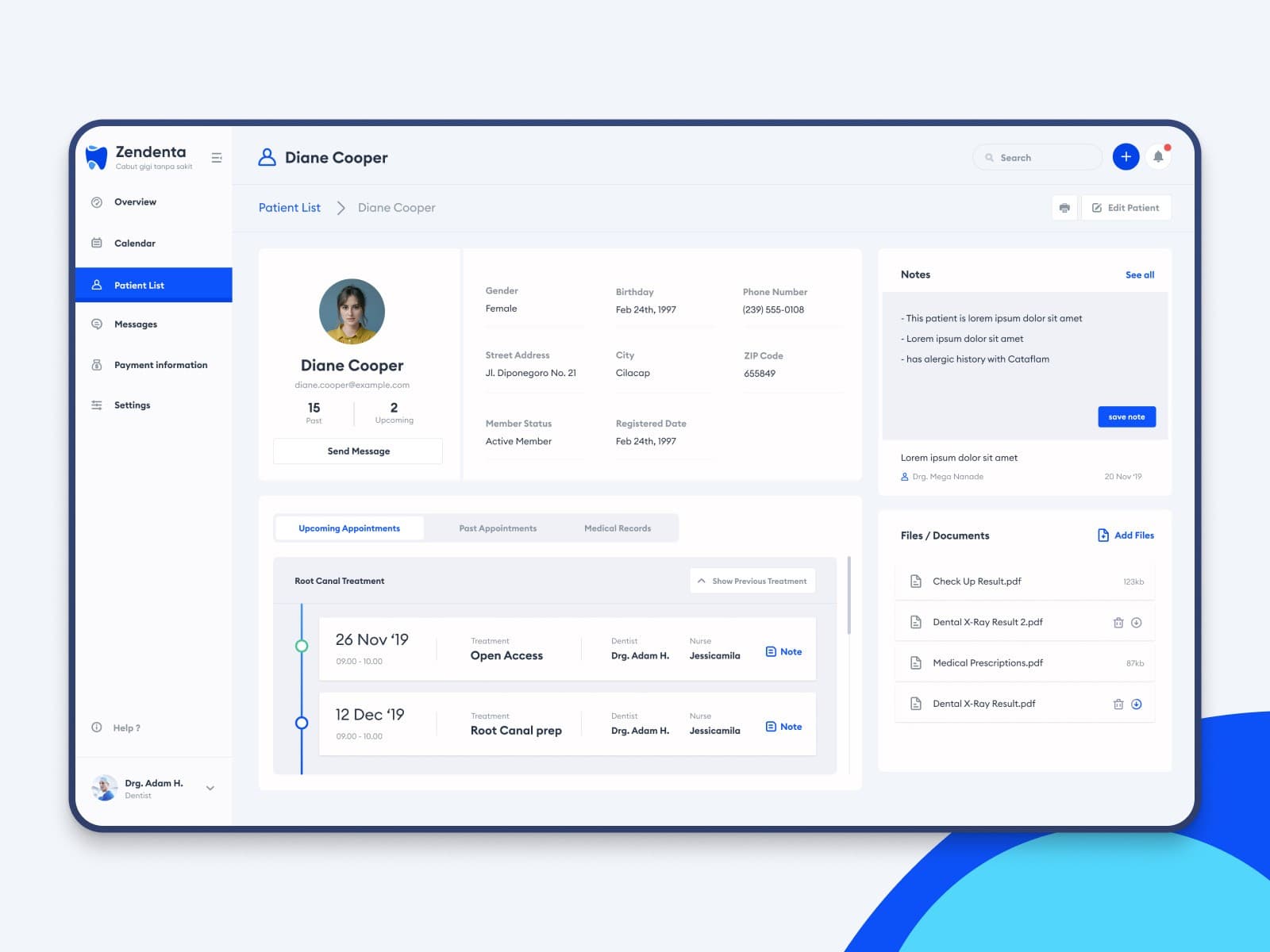
The sidebar contains the menu and can stay visible unless collapsed by the user. It can stay open all the time while the user navigates through the app.

At the same time, there is a minimalistic header containing the notifications icon, a search menu, page title etc. I don’t know if the bread crumbs are in the header in the example above, but it could be a good idea to include it as well.

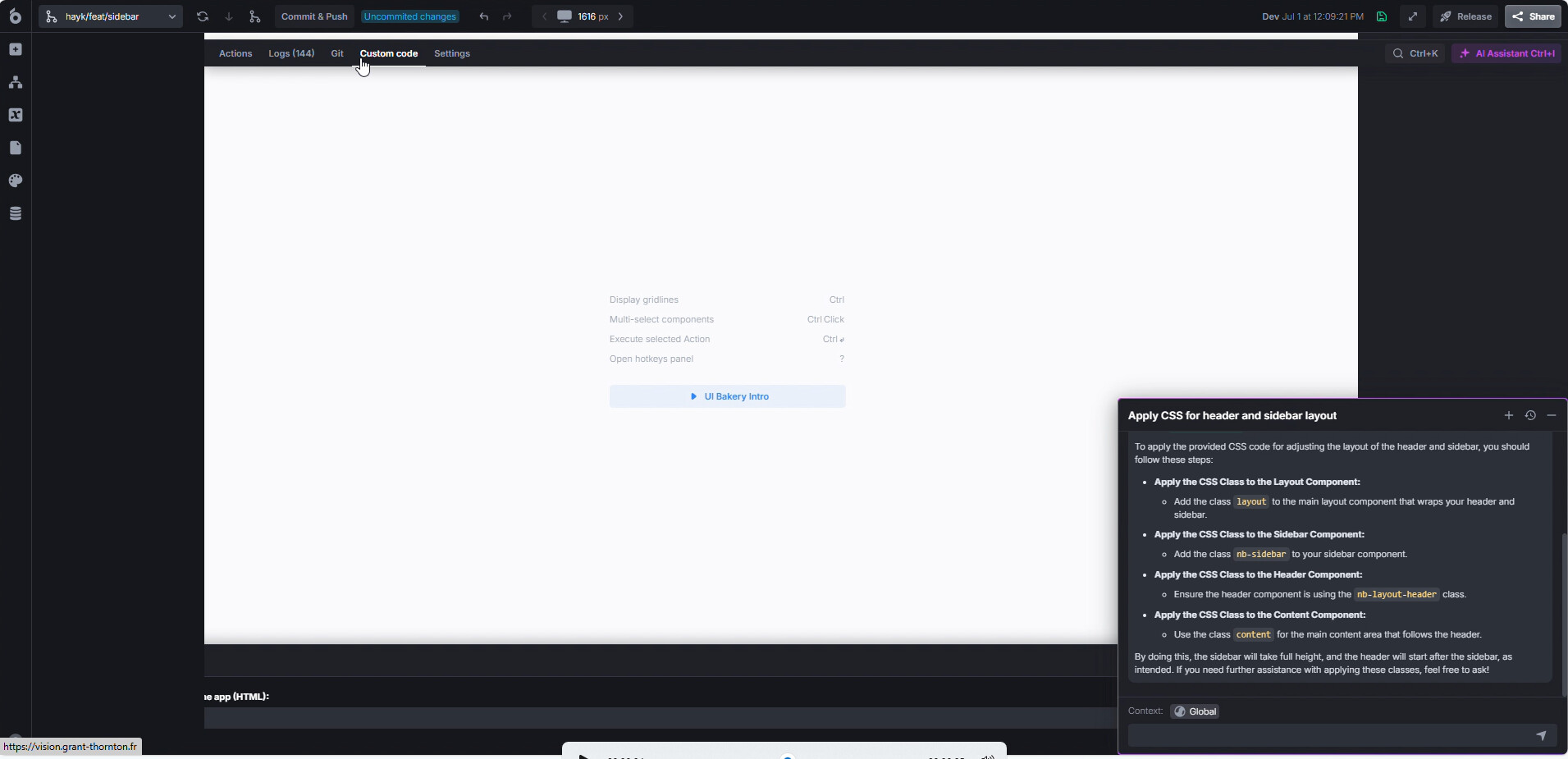
But the sidebar is full-height and the header starts after the sidebar.

The idea is to be able to change the dispositio like this:

1 Like

Hi @Hayk.Hovhannisyan

Technically, you could do this with CSS in the Custom Code section.

For example:

<style>
  div.layout {
  	display: grid !important;
    grid-template-columns: auto 1fr;
    grid-auto-rows: auto 1fr;
  }
  
  nb-layout-header, div.content {
  	grid-column-start: 2;
  }
  
  div.layout-container {
  	display: contents !important;
  }
  
  nb-sidebar {
  	grid-column-start: 1;
    grid-column-end: 2;
    grid-row-start: 1;
    grid-row-end: 3;
  }
  
  nb-sidebar:is(.expanded) {
    min-width: 250px;
  }
</style>

Will make the layout look like:

2 Likes

@Max, thank you very much for providing a fully-working code snippet!

Indeed it works! For the moment this messes up the builder when the AI chat is open, but that is not important.

Is there a way to make the sidebar width dynamic ?
It seems that nb-sidebar:is(.expanded) is deactivating UIBakery’s width property for the sidebar.

The idea being to have a variable that saves the state of the sidebar (fully-expanded vs minimal) to be able to show just icons instead of icons+text on my menu buttons.

Web side menu open and collapse interaction by Syed Maroof Muhammad Ali on Dribbble

2 Likes

What exactly is messed up when you open the AI chat? Because, when I’m opening the chat nothing really happens, everything works.


What you’re showing here isn’t dynamic either, it’s just two states, but it sure is possible:

nb-sidebar {
  grid-column-start: 1;
  grid-column-end: 2;
  grid-row-start: 1;
  grid-row-end: 3;
  min-width: 80px;
  transition: all .3s ease;
}
  
nb-sidebar.expanded {
  min-width: 250px;
}
  
nb-sidebar.collapsed .scrollable {
  width: 100%;
}

And with some components it will look like

sidebar_toggle

3 Likes

Thank you @Max, you replicated the sidebar behaviour i was tryding to do!
Thanks very much!!

For the AI chat, here is it’s impact on the builder when the styles are applied:

A) Before opening the chat


B) After opening the chat

1 Like

No problem, feel free to ask further if something doesn’t work right or you need help :slight_smile:

As for the AI chat, I’m unable to reproduce the issue. I tried with the on-prem and cloud version, neither broke. Pretty sure this doesn’t have anything to do with the CSS posted here, since that only modifies inside the editor container and the AI chat is part of a different container.

image

All components, containers, etc. (the editor) are inside the .scrollable-container, but the AI chat is inside the .cdk-overlay-container.

So you might want to check if you modified anything else. I think things like modals, popup forms, notifications and so on are also inside the .cdk-overlay-container, so if you applied custom code, you might want to check that out.

1 Like